Our completed first edit: http://www.youtube.com/watch?v=mdf_gD-gvA8&feature=channel_video_title
We still need to add titles to the beginning shot. We intend to only put titles over the first shot, as the following ones have too much movement, so would just be disorientating with titles. We created the title today, but due to my editing program (Power Director 8) the text went fuzzy and pixilated every time we actually played the clip; it was fine in the editing process. We also tried adding it as an image instead of text, and applying chroma key to remove the white background, but that went fuzzy too.
We also still need to add a breathing sound effect and a heartbeat sound effect. We did actually add the heartbeat.. so I'm not sure where that went... but it's probably something to do with the multiple sound tracks added to this video. We have multiple video tracks too. The split-screen we used needs to have the previous shot taken out from behind it, the timing in the sequencing got a bit messed up there. Other than that we just need to tighten up the bit where the Zombie gets beaten with Mildred, the stick, by the hero.
We'll do all that stuff in the next editing session.
Saturday, 3 December 2011
Tuesday, 29 November 2011
Logo
This is the logo we are going to use at the beginning of our film opening, before the opening title card and credits. Production company logos always appear at the start of films, with usually multiple logos displayed (we may create more for our final draft). This will give our film opening more authenticity.

Titlecard
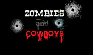
The titlecard from my previous post was a basic use of Microsoft paint and fonts downloaded from the internet. To make the titlecard more interesting and more engaging to the audience, I have experimented with adding some images to it I have added an increasing number of bullet hole images that I found on the internet to the titlecard. This could possibly be used with sound effects, with each version shown after the other to create the impression of shots fired. As the images, which I edited to improve how they looked (e.g. edited out website logos and corrected by size), are of bullet holes through glass, this relates to the presentation of the film on a screen, making the opening more interactive to the audience. It also closely relates to the genre of westerns and the red lettering used for the word 'cowboy' which has connotation of blood and violence, reflecting the aspects of horror.

This is an example of the images I found on the internet from websites such as gettyimages.com and shuttershock.com. I then edited them into my previous titlecard. This is the progression of each one:


By Clara
Thursday, 24 November 2011
The Representation of race through editing and sequencing in The Bill
The two races shown in this extract are Asian and British. By use of shot sequencing, camera angles and movements and editing they are represented as equal.
This extract opens with a high-angle shot of an Asian girl who is the suspect. This shot indicates that she is weak or unimportant, however as she stands up the camera pans up with her, keeping her central in the shot, therefore signifying that the action is revolving around her, and consequently that she is important, weather as a victim or an equal. From here there is panning across to an Asian police woman who is standing at the same level as her. This suggests that the two are equal, however as they are separated by the back of a male British officer, they are of opposing sides. The British police officer is not featured in this single panning shot until it smoothly becomes a tracking shot. This may indicate that he is considered of a higher class or importance than the two Asian women, however as he is in the same panning/tracking shot as them, he is supposedly equal to them. This may lead to the analogy that the two Asian people are not equal to the British man, however despite being of opposing sides, the two women are of the same race, so are therefore equal. In contradiction to this, there are two-shots of the two police officers. This suggests that although they are of different races they are equal. As the suspect is of the same race as the police officer, the immediate representation of the suspect is not a reflection on racial (in)equality.
Throughout this sequence the Asian suspect and the Asian police officer are opposite each other, and never in the same frame. This is obviously no reflection on race as they are of the same race; however the British police man is also never shown in the same frame as the suspect. Although he is shown in the same frame as his Asian co-worker, indicating that they are equal despite racial differences. Also a close-up on him is always matched with a close-up on the suspect. This suggests that they are equal, as are the suspect and the Asian police woman, as their close-ups are also matched.
In the interview there is an Asian man, in the background, sitting beside the Suspect. He is only ever shown in shots with the suspect; never in the same shot as either police officer, Asian or British. A two-shot of the police officers is always matched with a two-shot of the suspect and the Asian man. This indicates that the two Asians are represented as being opposed to the police, possibly linking to the racial stereotype of Asian terrorists. The Asian man is sitting opposite the Asian police woman; however they are never in the same shot. This denotes that they are against each other because she is an authoritative figure, representative of law and order, not because of race. He is also wearing a turban, stereotypically linked with terrorism, where she is in a police uniform. The Asian man and Asian officer are both quiet during the interview, where the suspect and the British man are talking intensely. This indicates that the Asian man and officer are against each other, where the British officer and the suspect are against each other. This could be representative of two rifts in society; the rift between figures of authority such as police officers, and civilians, or possibly terrorists, and the rift between British and Asian people. The British Officer and the Suspect both appear closer to the camera and higher in the frame, so are represented as more important than the other pair.
When the British man says “…interracial harmony,” the focus is on the Asian police woman, therefore suggesting that there is interracial harmony between the police officers, however this may not be so in the case of the suspect. The British police officer says, “I don’t do racism”, this is reinforced by a close-up on the Asian police officer directly after he states this. There is then a close up on the suspect. This may indicate that he is equal to her as well as to his colleague.
All of the editing and sequencing in this clip indicates that the Asian characters are equal to the British man, the only factor changing their equality is the police officer’s power and authority. In general this extract uses a range of techniques to represent race equally.
Tuesday, 22 November 2011

Film Opening - Sound
We looked at a range of sund effects and techniques and we have come to a decision to use the following sounds:
. Heartbeat effect
. Breathing effect
. Zombie growl effect
. Car alarm effect
. Footsteps effect
. Ecstasy of Gold (Music)
We decided to use these effects as we studied many zombie films (EG. Shaun of the dead, Dawn of the dead, Zombieland, 28 Days Later) And we also studied some westerns (EG. The Good, The Bad and The Ugly, Magnificent Seven, Fistfull of Dollars, For a Few Dollars More, Paint Your Wagon.) And we analysed common sound motifs used in these genres. We wanted to base our film in the modern era, and to use mostly zombie film style sound effects, however we decided on the western style music to combine the two genres. The zombie sound effects are generally used in zombie horror movies to create fear in the audience, though in our film opening the desired effect is more based around comedy due to the ridiculousness of the combined genres. These effects will build the intensity of the opening until the comedic payoff of the slow moving zombies.
We decided to use the song Ecstasy of Gold as part of our soundtrack and also looked at the differences between soundtracks and musical scores. Soundtracks are made up of various found songs from different artists and sources, while scores are originally composed for the film. The style of the score will generally be based around the genre of the film.
We decided to use our effects as sound bridges and form a soundscape over footage of the little guy running.
These sounds will work as anchorage, to inform the viewer of the modern context, while including an underlying western theme, combined will common features of a zombie film.
Filming schedule
Shoot film: 26th October (2pm - Summertown)
Reserve filming date: 30th October (2pm - Summertown)
Editing: 29th November (My house after school)
We managed our time effectively by creating a group thread on facebook, to see when our whole cast was available. Originally we were considering filming on 28th October, however we had to change our date due to unavailability (A father's birthday.)
We planned a reserve date for filliming incase we didn't finish filming on our in
itial date, or if we had to cancel for whatever reason. Upon uploading our footage to my computer we discovered a shot missing, so on 30th we filmed that shot and all was well.
We have each worked on individual pieces of editing/typography/music, and on 29th November we are going to combine our work and hopefully finish our film opening. :)
Sunday, 20 November 2011
Discuss the ways in which the extract constructs representations of gender using the following: Camera shots/angles/movement/composition, Editing, Sound, Mise-en-scene
In Doctor Who women are presented as generally equal to men as their roles and superiority change throughout the extract, however the woman in the red dress is presented as superior to everyone. At first the master, and therefore men, were more powerful and important than women. The master was in control and the only women were the woman in the red dress and Martha’s family, dressed in maid uniforms. This lowered their status. However when Martha was brought in, although she was dragged, she was central in all of the shots and therefore presented as an important character. There were many close-ups matched between the Master and Martha, signifying that they are both important and equal, however as the extract progressed the close-ups on the master began to show his weakness, whereas Martha was shown as powerful. However Martha, at times is presented as weaker than the Master by high-angle shots of her matched with low-angle shots of the Master. High-angle shots of all of the other characters are also used in conjunction with low-angle shots of the Master, and the woman in the red dress, showing that they are more important or powerful than the other characters.
Throughout Martha’s speech, where she explains her plans to defeat the Master high-angle close-ups of her are juxtaposed with a clear sense of authority. Martha is also presented as powerful as she is wearing dark, military-esque clothing and has her hair tied back. This indicates that she is prepared for action and is able to defend herself, however these traits are sometimes associated with men, and are deemed manly. As Martha is speaking the music begins to build up and become louder and more intense. This indicates that Martha is powerful as the music is on her side, and as the music is very powerful and hopeful sounding, it shows that she is good, therefore denoting that women are generally good and powerful as a group. After Martha’s speech the master is obviously very weak and frightened, showing that he may be defeated by a woman. However the music becomes much more intense as the Doctor becomes more powerful, indicating that he is more important than Martha. The importance and power levels of male and female characters are constantly being reversed throughout this extract, therefore representing both genders as equal.
Although the woman in the red dress has a frightened expression and is standing behind the railing as if she has been put on a shelf by the man, the shots are composed so that she is higher up than the man, suggesting that she is more important. She looks as if she is looking down on the events and seeing them from a god-like perspective. This is partly due to the woman's costume. Her hair is styled in a casually coiffed fashion, and she is wearing little make-up, the style of her dress is almost Greek goddess-like, with a modern seductive twist. The red of her nails and dress connotes power and possibly evil. She looks out of place in the scene as she is the only colorful thing there, and she is not simplistically dressed. The master is dressed in a simple black and white tuxedo, which shows he is rich, however he looks untidy in comparison to the woman and their environment. He consistently holds a fairly casual posture, and looks relaxed until he is challenged by Martha. Where the woman is standing straight and powerfully, he is slouching informally and this ridicules him slightly. He looks as if he is comfortable in this environment, possibly because he thinks that he is in control, and is possessive towards the woman, however she holds a passive and strong position and is higher up, so may feel that she knows she is more important than the man.
Their surroundings are simplistically decorated with modern natural wood furnishings. However there are also high-tech scientific diagrams on the walls, and unnatural lighting. The wooden furnishings therefore seem pretentious. The ceiling is large and black, this looks intimidating and gives an underlying effect of tension and makes the scene seem more dangerous. There is unnatural white lighting coming from the left onto the background and the man, the fact that it is not natural connotes that his power is superficial. However the lighting on the woman is coming from the right side, and is an unnatural pink/red light. This could show that she is a much-loved possession of the man, but also that she is seductive, powerful and/or evil.
There is a point in the narrative of this extract where all of the characters, except for the Master, repeat the word “Doctor” over and over again. The woman in the red dress also joins in with this, despite apparently being on the Master’s side. This shows that she is intelligent and morally sound, possibly representative of woman as a stereotype. There is a high-angle shot of her as she says this. This shows that all of the characters, and therefore genders are equal in their bid to destroy the Master and restore the Doctor. It also denotes that all of these characters are less important than the Doctor, who is male. When the Doctor is restored to his original form, he emanates an ethereal light and floats towards the Master in a powerful way. The Master and the Doctor are against each other, and the Master tries to kill the doctor by use of a sonic screwdriver, however the Doctor is more powerful, and takes the screwdriver from him. The Male protagonist and antagonist are therefore presented as cooler. They are the characters which are involved in the action and are therefore more important. While this happens Martha is shown running and hugging her family, who are dressed as maids. This shows that they are equal, however Captain Jack, and other male characters are also in the same position as Martha and her family. This signifies that gender is not intentionally reflected on in the Master and Doctor’s battle. There are also close-ups of a countdown timer, consistently placed throughout the extract. This could signify that the operation underway is more important than any of the characters, male or female.
In general women and men are presented fairly equally, as their importance and power statuses are reversed constantly throughout this extract. However the main female characters in this extract are presented as much more intelligent than the Master or the Doctor, both men. The Master and the Doctor are both presented as much more action-based characters who despite being important and more physically strong than the women, are not as powerful as Martha or the woman in the Red dress. All of the characters shown in the outside world after the Master’s defeat are shown celebrating together, male or female. Therefore connoting equality between males and females in this extract.
Tuesday, 8 November 2011
Title boards


This is a potential title card for our film opening. I used the fonts that I had experimented with in an earlier post but edited them onto Microsoft Paint. As the background is now black, similar to the title card of Dawn of the Dead, I changed the colour of the words to red, white and gray so they would be visible. I chose these colours because of the connotations with blood and the contrast white has with red. I used grey for the 'and' to make it more neutral and as close to the background while still visible as possible so the other two words would stand out more.
The other set of writing will be edited onto the film opening over shots rather than in a title card as to keep the action in the film flowing without being broken up too much by titlecards. I used the same fonts to continue the theme though different colouring to make it stand out more.
Props For Our Film Opening


These are some Western style clothes we based out costumes for our film on. Unfortunately none of us had cowboy boots at hand, so we had to make do with what we had, however we used cowboy hats for the Hero and the Little Guy, and tried to use neutral colours and shirts where possible. The clothing is all very casual as we pictures out film taking place near the beginning of the apocalypse, so there would have been no time to gather provisions or more appropriate clothing, and as the film is set in the modern day there are only elements of Western cowboy-esque styles in the costumes.

We used fake blood in our costumes as well, to give the film more of a genuine zombie feel. We used it mainly on the zombies as they have been eating flesh, but not on the humans as they have been avoiding this. We also spattered it onto most of our posters. This way the mise-en-scene is more appropriate for our film.
Chosen Location for Our Film Opening!
We have taken some photos of the location that we have chosen to shoot our film opening in.


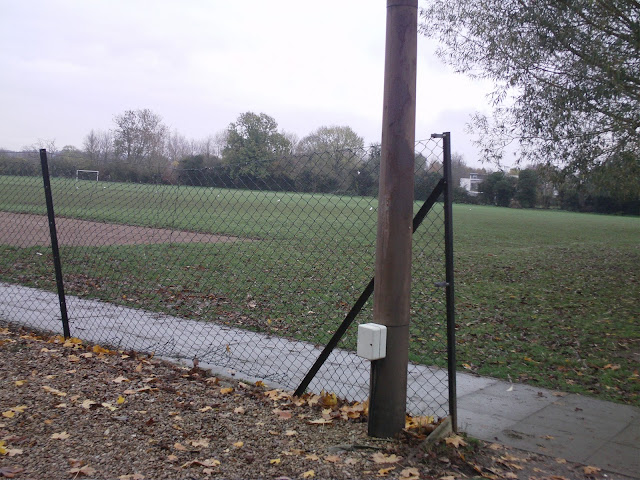

This is the road we chose to film on. It has the lamp post that we needed, some rails for zombies to swipe at the ,little guy through, and our shots can be framed by the trees and buildings on either side.

These railigs will be where the zombies first target the little guy.

This is where the little guy runs into a post during the zombie-chase sequence.
The area we are using is the road next to the South Site carpark.
Thursday, 3 November 2011
Script for our Opening.
As our opening only includes one line our script is very simple and is mostly stage-directions.
Zombies who are also cowboys
Little guy: (Run down street, panting and looking a bit scared)
Tilt-shot on the little guy running away from the camera through the shot.
Over-shoulder shot.
Dutch-angle close-up on Little-guy's feet running.
Medium tracking-shot
Zombie 1: (Swipe at little guy with claw.)
Tracking side-close-up of little guy's face.
Tracking side-close-up of little guys arm and torso.
Medium shot
Little guy: (Still running)
Zombie 1: (Chase Little guy into shot slightly)
Medium-close-up of a lamp-post.
Little guy: (Run into lamp-post and pass out.)
Bird's eye zoom-out of little guy on floor.
Dutch-angle medium long-shot of little guy on floor, zombie 2 in background.
Zombie 1: (Step 1 leg into shot)
Extreme close-up of zombie 2's eyes
Extreme close-up of zombie 1's mouth
Close-up of zombie 1's hand.
Zombie 1: (Swipe air.)
Close-up of zombie 2's legs
Zombie 2: (Shuffle forward)
Split-screen tilt-up shot of both Zombies.
Extreme close up of each zombie's eyes in quick succession.
Establishing shot
Zombies: (Pause and then shuffle towards little-guy slowly)
Medium-shot from behind zombie 1
Medium close-up of zombie 1
Medium close-up of zombie 2
Medium close-up of zombie 1
Hero: (Hit Zombie 1 over the head with a big stick.)
Close-up of zombie 1
Zombie 1: (Fall over, gurgling)
Over-shoulder of zombie 1 falling.
Tilt-up shot from zombie 1 to hero
Hero: (Kick zombie slightly, take off hat, rub head, replace hat, spit on zombie) Eat timber! Aha!
Final Zombie Poster

The is one of the posters we made, splattered with blood and trampled on after shooting our opening. It was featured on the floor in a dutch-angle close-up of the little guy's feet running.
Zombie Posters
In our film it is set relitively near the start of the zombie apocalypse so we had to print off some zombie warning posters. These kind of posters are likely to still be there for a while into the apocalypse, and they are obligitory to improve our mise-en-scene. By seeing the posters the audience will emmidiately make links with zombies and therefore anticipate attacks.


Here are some examples of zombie warning posters we found on the internet. They mostly contain breif information on zombies, to inform the general public and alert them of zombie-safety. We decided to mention a curfew in our posters, and warnings not to approach the infected.
Here are some examples of zombie warning posters we found on the internet. They mostly contain breif information on zombies, to inform the general public and alert them of zombie-safety. We decided to mention a curfew in our posters, and warnings not to approach the infected.
Wednesday, 2 November 2011
My Film Opening
Our creative uses of technical skills include varying shot distances, having the music tempo match the film and also matching the pauses in the sound-track with pauses in the film. We will also use editing to create greater effects on the audience when Zombies appear in the film.
Much of our film opening is filmed using hand-held or Steadicam, however all of our stationary, or panning shots are filmed using a tripod so as to keep the shots still. The steadicam is used to elevate the tension and give a sense of urgency to the film, but the shots using a tripod help the audience to understand what's going on better, while still keeping the perspective of the Little Guy while he is still conscious. When he falls unconscious there is no more steadicam in the opening, showing a change of perspective.
In the shot with the little guy lying in the middle, the shot is framed by the two zombies, and the film opens with a tilt shot on the scene with the little guy running through it. This is framed by the buildings and trees, however not much else is framed very well. We should probably think about that some more.
We have varied our shot distance appropriately in the bit where the two zombies are about to try to attack the little guy. There is a number of close-ups on the zombies, followed by a long shot of the two zombies with the little guy in the middle.
Our film opening is appropriate for the task as it shows a range of techniques as well as being of a subject matter appealing to a wide audience.
As our film would hypothetically be set around the beginning of a zombie apocalypse we were sure to include many posters relating to curfews and zombie safety and such. Also all of the buildings are still standing. (However if we had a higher budget we would probably set some fires and break some windows in an empty street, and ensure that everything is more dirty and dark.)
When editing we will probably slow some shots down to put emphasis on the horror of being in a zombie apocalypse. We will also break up any concentrated amounts of close-ups with long shots or establishing shots so as to include as much detail as possible while following a narrative.
We intend to use alot of zombie sound effects such as groaning. The only dialogue we have in out opening is "Eat timber" said by the hero at the end, and this is said with no soundtrack of sound effects in the background to draw emphasis to how relaxed the hero is, and how he seems to gain pleasure from killing zombies. We are going to use Metallica's cover of Ecstasy of Gold as our soundtrack in the opening. This is because it is a western song, but with a modern twist that will tie in with the mixed genres nicely.
Our title's font relates to both zombies and cowboys as it incorporates aspects of both genre's typography. We will also put credits over certain shots in the opening, mostly in the darker areas on the screen, possibly in red writing so it matches the themes of horror, while not looking out of place in the shots.
Tuesday, 1 November 2011
Write-up on My Short Film.
My film was a music video for Green Day's "Wake me up when September ends", documenting my travels to the arctic last summer. I wanted to show the audience the sheer awesomeness of that I experienced while also showing how completely serene some of the places I was were. This is partly why I chose that song, as it has a fairly slow tempo, while breaking into heavier guitar at some points. I tried to match the tempo and volume of the music with a similar speed in the footage. I hoped for my video to have an almost epic feel.
I included alot of shots of birds soaring in the open sky to illustrate how amazing it was to travel in these places, and the feelings of freedom I felt. At one point I included a shot of a buzzard flyng overhead, I began this shot at its original speed, but when the music became a bit heavier I sped up the clip so the effect was slightly more jerky and wild, and also less serene-looking, to match the music. When the buzzard had wheeled around and was almost directly overhead again I slowed the clip to its original speed to bring more focus to how beautiful the bird was. This not only paralleled the overall impression of the places featured, but it gives more substance to the theme of travelling. This is assisted by various shots from out of windows on transports such as buses, trains and planes.
As the music became more intense towards the end, I used only panning of landscapes as apposed to breaking this up with close-ups and such. I changed shot at the end of every bar or music. This was followed by the music suddenly becoming quieter over a shot of a plane's wing out of the window. This shot was also used at the begining of this video so it almost turned full circle. It was also very still in comparison to the aforementioned panning to matched the soundtrack. I sequenced in like this to show the epic expanses of land covered and the incredible experiences. The wild music matched the wild places I saw.
Wednesday, 19 October 2011
Typography
Typography is the art of lettering based around the style, size, font and type being used. As a large amount of lettering is used in the credits of films, it is a significant area for us to investigate. The opening credits and the title board of a film give the audience an impression of the overall tone and genre of the film because of associations we have with certain styles of lettering. Writing is also sometimes used in film to display the place and time events are occurring. As typography establishes so much about the style of the film, I have looked at different uses of it in film.
Our aim is to create a film opening that comically combines the two contrasting genres of Westerns and horror. Both are very recognisable and stylised, meaning audiences will gather expectations for the film based on the association of the font used.
Westerns are one of the oldest film genres, as they were based on popular Western fiction in other media from the late 19th century, the style of typography used in them has developed over time.

Posters such as these were used in the actually Old West and the typography used in them was developed into the lettering seen in Western films.


These are screenshots from Sergio Leone's 'The Good, The Bad and The Ugly'. It is a Spaghetti Western, a more arty and stylised type of Western made by Italian American directors. The typography mimics the aforementioned posters typography, giving the film and impression of authenticity. The manner in which the lettering appears on the screen is reminiscent of a splatter of blood, emphasised by the sound of gunshots. The font is large and consistent in the centre of the screen, signifying strength and certainty of the characters and theme of the film.

A similar technique of transition is used in this horror film, 'Dawn of the Dead'. The typography more realistically changes into blood and disperses than in the Western. This could be due to the darker tone of the horror genre and more graphic nature of the violence in this film. The colour also connotes aggression and blood, relating to the death caused by the zombies and the infection of the disease. The font used is also in the centre of the screen, signifying the strength and relentlessness of the threat in the film. It is also less decorative than the Western font, showing that the film is more serious.

This is from David Fincher's 'Se7en', a crime horror film about murders based around the seven deadly sins. The typography used here is small and off centre as the lettering flickers, signifying fear and the fragmented nature of the characters and tone of the film. The font is simple and childlike, contrasting with the image on screen in an unsettling manner. White is used for the letters to emphasise the darkness of the rest of the image, making the words seems very distinct.

The colouring here also contrasts with the background, emphasising the significance of the typography. The lettering is slightly more rough and and less formal, relating to the cartoonish drawings in the title sequence. The Walking Dead television show was based on a comic book, meaning that the visual style of typography relates to this.
From looking at this examples of typography, it's clear that relation of the lettering to the visuals is especially important, as well as the positioning of title and credits on the screen.
To find a suitable font for our film opening, I used the website http://www.dafont.com/ which provides free downloads of a range of fonts in different styles.

This is a fairly simple font used for every word that reflects Western style of typography. However, while it is more comical and informal than some fonts, I think that the combination of genres is not obvious enough and could be represented better through the use of contrasting styles.


I used contrasting fonts in this example. First I used the more horror associated style with the word 'zombie' and Western style for 'cowboys'. However, to make the combination of genres more clear, I swapped this around, using the red, violence associated font for 'cowboys' and Old West style for 'zombie'. The positioning of the typography is uneven, signifying the damaged and fragmented nature of the zombie attack.
(Clara's stuff)
Audience Research
The opening of a film is very significant as it establishes the overall theme and tone of the film and gives the audience an impression of what they will be watching. Characters, setting and narrative must be taken into account when making a film opening, as these must all be introduced if not in the opening, (in some cases the openings act as more of a prologue than an introduction) early in the film. It should set up or foreshadow the narrative but also establish the atmosphere of the work. Filmmakers must know what will appeal to audiences and make them want to continue to watching. Different genres have different audiences, meaning that a combination of genres will attract a wider range of people; in our case aspects of horror, comedy and western themes will be used.

This is the top ten UK box office results from last week. It displays a wide range of genres, including horror, comedy, thriller, drama, romantic comedy and family films. The genre of horror is popular with audiences because it is enjoyable to be scared and they are easy to watch and highly entertaining, unlike some of these films which may be more complex and difficult. Horrors and comedies usually allow the audience to sit back and relax, to an extent, as there is not too much plot to take into consideration, so it is very easy to follow.

This graph from the UK Film Council shows the demand for different genres of films, based on a poll taken by 1978 people. As is also shown here, the genre of horror is fairly popular, though Western is much less so. This is because of the gradual loss of mainstream Western movies over time. They were very popular in the early to mid 20th century, as the whole genre of Western in other fiction had been prominent around that time. Since then Westerns have become far less popular and it is unusual to see them in the cinema. However, there has been a phase of modern Westerns becoming popular, such as the American television show Justified. Remakes such as '3:10 to Yuma' and 'True Grit' have been successful in the last few years, indicating that Westerns and genre films in general may be gaining popularity again. Our film also would aim to increase the popularity of western films by combining this genre with a currently popular one. It is an original concept that is likely to catch people's attention.

This shows that both Westerns and horrors are more popular with men than women and generally younger people. This could be because of the exaggerated fast paced nature of them. Because of this we will aim to target young people, however we will try to appeal to both genders to an extent, although as generally horror, and therefore mostly violent films are more popular among a male audience our film probably will be more appealing to guys.
Tuesday, 18 October 2011
Film Opening Music
The music we will use has to be western themed, but become intense fairly quickly to correspond with the zombies and their battle. Ideally the music would be fairly dark to give zombie-esque qualities, and should also have a pause for the establishing shot in which the 2 zombie begin to shuffle towards each other. (But that is very specific, so it is unlikely that I will find something exactly right, and will have to make do with whatever I can find.)
I listened to many western film scores on you-tube, but I have narrowed my choices down to these two:
I listened to many western film scores on you-tube, but I have narrowed my choices down to these two:
The first video, "A Fistfull Of Dollars" is also by Ennio Morricone, and is much more traditionally western, however I think the second song would fit out film opening much better.
I prefer the second one as not only does it sound much more zombie-esque, while still being originally western, but it provides a good link to the modern themes that our opening includes. Zombie films are a fairly modern concept, so using this will blend the modern zombie aspects with the old western themes much more effectively. This song was originally composed by Ennio Morricone for the film, "The Good, The Bad, and The Ugly", however Metallica have done a cover of it and used it extensively in their concerts. There is also a suitable pause in this song before the heavier guitar comes in, which could be used to our advantage.
Casting for my Film Opening: Zombie Cowboys.
Some initial ideas for casting are:
Use a wide, empty space to shoot it, it must have a lamp-post and be deserted. We could possibly use the school south-site car park one evening or week-end, as long as we make sure we don't get anything particularly colourful or nice-looking.
For costumes we need:
At least 3 cowboy hats, (1 for each person, unless we're missing one, in which cast the little guy would be missing one.)
Everyone in faded blue jeans,
Neutral coloured shirts for everyone,
If cowboy boots are available we will use them, if not neutral coloured shoes, boots (even if not cowboy boots) if possible.
Make-up:
Toilet paper and glue can be used to make saggy or tearing skin for zombies.
Everyone including the zombies will have dirty faces and look haggard, but extra grey make-up will be used on the zombies.
I have watched a range of zombie make-up tutorials on you-tube, but this one (Shown in class) shows how to make realistic cut effects: http://www.youtube.com/watch?v=7dW0A4rnnYk
For the stabbing of the zombie we will use ketchup or fake blood, and stick a knife through the shirt from the inside-out, and we will masking-tape it to the actor and his shirt. This will be effective enough, as the knife isn't shown going through the subject, so we can put it in, between shots.
So far we have cast 2 people, the little guy will be played by Livy Hull, and Zombie 1 will be played by Alison Gamble, but we have some ideas for the other 2 cast-members, it's just a matter of convincing them to join us.
Todorov's Narrative Theory
Equilibrium/Disruption
3 act structure is aligned with a timeline, visually presenting the equilibrium or disruption of the intensity of the film.
This always begins with equilibrium and becomes disrupted around act 2, but eventually returns to equilibrium after the climax, at the end of act 3.
Example of a Todorov's theory kinda graph:
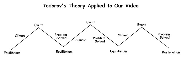
Super 8
3 act structure:
1. From the beginning to the train crash business.
This includes the opening, which was the mum's death sequence, it established the back-story and the characters. It also began the narrative arc of the boy letting go of his mother, and established the setting, film-making theme and the motif of the power surges related to the alien.
2. From the train crash to the army bus crash.
Thus basically built the intensity and urgency. Also began the decent of the town into chaos.
3. Bus crash to the end.
Closure was reached as the alien was freed, the son and dad come together (pay off was in the hug) and the son was finally able to let go of his mother.
Letting go of his mother's necklace was a good pay off and also an end to the aforementioned narrative arc; he lets go of his mother and is no longer dependant on her and can finally accept her death.
The father and son are moving in different narrative arcs in the same direction, trying to work out the motives and conspiracies behind the air force's train crash. Their arcs meet in act 3.
The production value was INSANELY high. There were a lot of special effects and pyrotechnics. Also a public place was used, not a studio.
Thursday, 13 October 2011


Tuesday, 11 October 2011
A Well-Edited Clip.
This is a clip from the film, Up In The Air. (Sorry about the poor video and sound quality, I couldn't find this particular clip anywhere, so had to film my TV)
I really like the combination of diegetic sound with the motif of the bongo music for the suitcase packing. (I'm pretty sure it happens every time he packs a suitcase) Also the way the music breaks for him to say, "Christ." works well. It gives a kind of curious humor to the clip. Although I like sound bridges, the lack of one here works really well to distinguish between the suitcase packing and the previous and postvious scenes, it almost categories elements of traveling.
The scene changes just as the ball would hit the floor, so it's almost as if the scene rebounds instead.
The shots change in quick succession so the audience registers what is happening and recognises that George Cloony likes it to happen fast. (He speaks about how he likes moving fast throughout the film, and this clip parallels that message rather nicely.) However the moment when he forgets to put his cardboard cutout in and has to work out how to fit it is effective at not only forming a bridge between the fast-paced packing and the walking in the airport, but also showing how things may not always run smoothly, but compromises must be made, and this is a big theme in the film. I like the POV shots of George Cloony, from the suitcase's POV, his expression and the way it's at such a low angle, gives the impression that he's created something strange. (This is also humorously curious.)
Very good use of match-on-action, and nice POV shot of the cut-out trying to be fitted into the case. This puts the audience in Cloony's position, which is one most people can relate to.
Also the tilt/tracking shot of the suitcase with the cutout sticking out of the top is a nice way to start the next scene as it completes the anecdote of the last scene. Also it's lighthearted and generally aesthetically pleasing.
Assigned roles for making a Film Opening.
The roles to be assigned are:
1. Typography
This includes creating title-boards, font, sizing, spacing and positioning must be considered. Also relating to credits during the film opening.
2. Story Narrative
This is basically deciding on the story-line of the film. A narrative time-line should be made, listing the various sequences in a 3 act structure. There must be narrative closure, or pay-off to ensure the audience feels gratified by the ending of the film, and feels that there is some meaning to it. There should also be narrative arcs. (Basically a visual representation of the high and low points of the plot and it's dramatic developments, including key turning points, or moments of particular importance.)
3. Audience research
This is basically looking into the types of people that may want to watch the film, and finding out how to appeal to them. Decide what age group it is suitable for, and who may find it entertaining for whatever reason.
4. Visual planning
This includes story-boarding, and generally planning the film opening using narrative time-lines and/or maps.
5. Music
A score must be chosen that is suitable for the film, and must be applied to the film opening accordingly. If applicable a motif of sorts may be established. (Though it is a very early stage in the film, so that may not be a realistic option.) Ambient sound may be used, and also dialogue or possibly a voice-over.
6. Casting.
Locations must be established, and also a schedule for when things are to be shot. Also actors must be chosen to play the characters. If there are particular features needed in the world of the film, the casting director should probably arrange that.
Relating to my project:
Me and Clara have assigned the roles of Visual Planning and Music to me, and Audience Research and Typography to her. We are communally working on the Story Narrative and Casting.
We have already finished most of our work on Story Narrative, however we intend to decide on all the casting business in class, or in our various meetings.
I will make a full narrative time-line diagram and storyboard to be uploaded, and research western and also zombie sound motifs, as well as researching the conventions of western film scores. (Probably staring with The Good, The Bad and The Ugly.)
Subscribe to:
Comments (Atom)