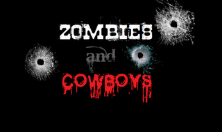
The titlecard from my previous post was a basic use of Microsoft paint and fonts downloaded from the internet. To make the titlecard more interesting and more engaging to the audience, I have experimented with adding some images to it I have added an increasing number of bullet hole images that I found on the internet to the titlecard. This could possibly be used with sound effects, with each version shown after the other to create the impression of shots fired. As the images, which I edited to improve how they looked (e.g. edited out website logos and corrected by size), are of bullet holes through glass, this relates to the presentation of the film on a screen, making the opening more interactive to the audience. It also closely relates to the genre of westerns and the red lettering used for the word 'cowboy' which has connotation of blood and violence, reflecting the aspects of horror.

This is an example of the images I found on the internet from websites such as gettyimages.com and shuttershock.com. I then edited them into my previous titlecard. This is the progression of each one:


By Clara
No comments:
Post a Comment